Archive and Statistics
The Timeline and Table views, plus the Statistics screen (cycle length, symptom frequency).
Archive tab
The Archive tab (wave icon) holds the full record of your logged entries. This is the part of the app for reading, not doing. You can view it in two ways, switchable with a segmented control at the top of the screen.
Timeline view
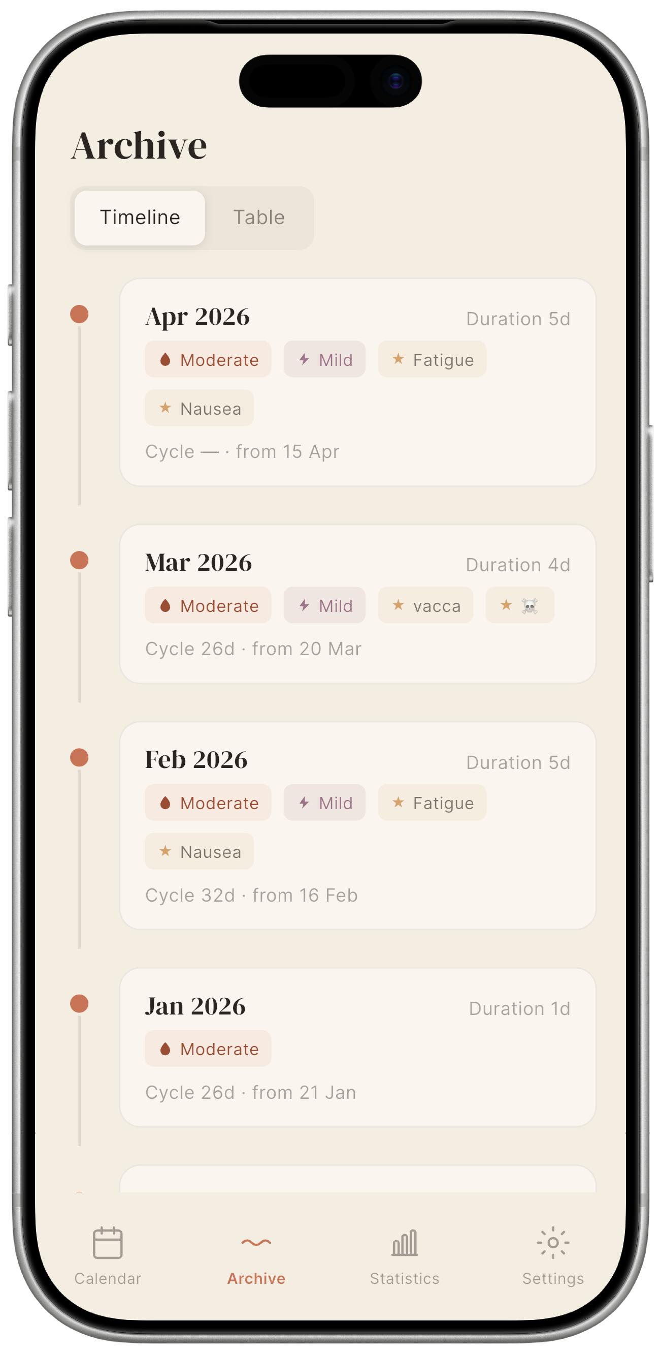
The Timeline view groups your entries by cycle, one card per cycle, most recent at the top, earliest at the bottom. Each card shows:
- Start date and cycle length in days.
- A series of pastel-coloured labels summarising what was logged during that cycle:
- terracotta with a droplet for flow, showing the intensity or spotting;
- mauve with a lightning bolt for pain, showing the recorded intensity;
- ochre with a star for symptoms, covering all symptoms logged during that cycle;
- grey with a pen icon, indicating notes.
Scroll up to go further back.
Table view
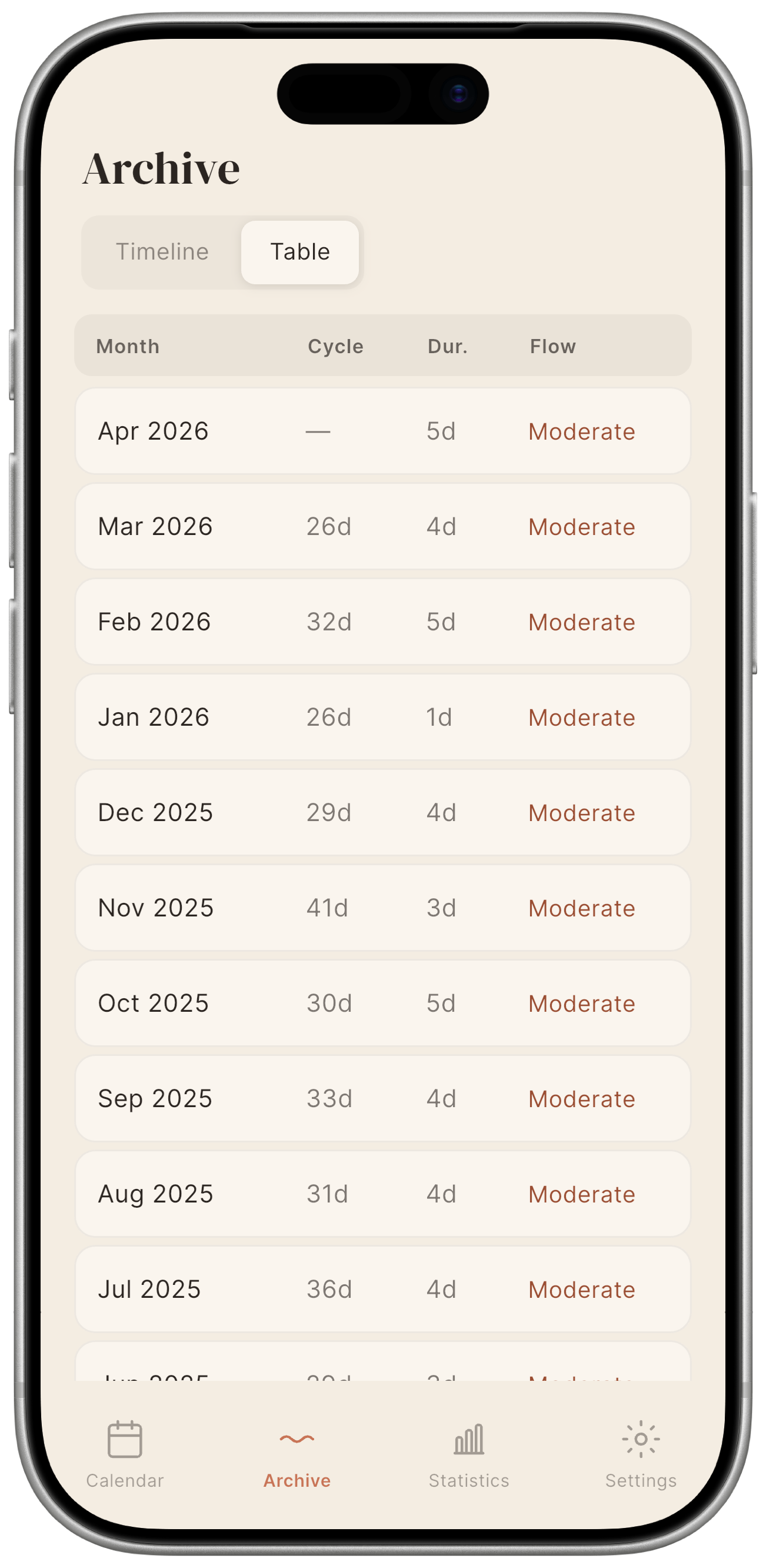
The Table view shows one row per logged month, useful when you want to compare several months at a glance. Columns:
| Column | Content |
|---|---|
| Month | Month and year. |
| Cycle | Number of days in the cycle. |
| Dur. | Number of menstrual flow days. |
| Flow | Average menstrual flow intensity. |
Statistics tab

The Statistics tab is the numerical side of the same archive: where the Timeline and Table show individual days, here Mētra calculates averages and distributions across the full set of parameters logged during your cycles. All calculations run locally on your device — no external service ever sees these numbers.
Summary cards
Four headline figures at the top of the screen:
| Card | Meaning |
|---|---|
| Average cycle length | Mean number of days across all complete logged cycles. |
| Average period length | Mean number of consecutive menstruation days per cycle. |
| Average pain | Mean pain level recorded across all cycles, on a 0–3 scale. |
| Tracked cycles | Total number of complete cycles in your history. |
These cards update every time you save a new entry.
Cycle length chart
A bar chart showing the length of each cycle in chronological order. If your rhythm has shifted over recent months, this is where it shows.
Pain intensity chart
A bar chart showing the average pain intensity for each cycle in chronological order, on the same 0–3 scale used when logging. Mētra calculates this locally, nothing transmitted. An outlier cycle stands out immediately.
Symptom frequency chart
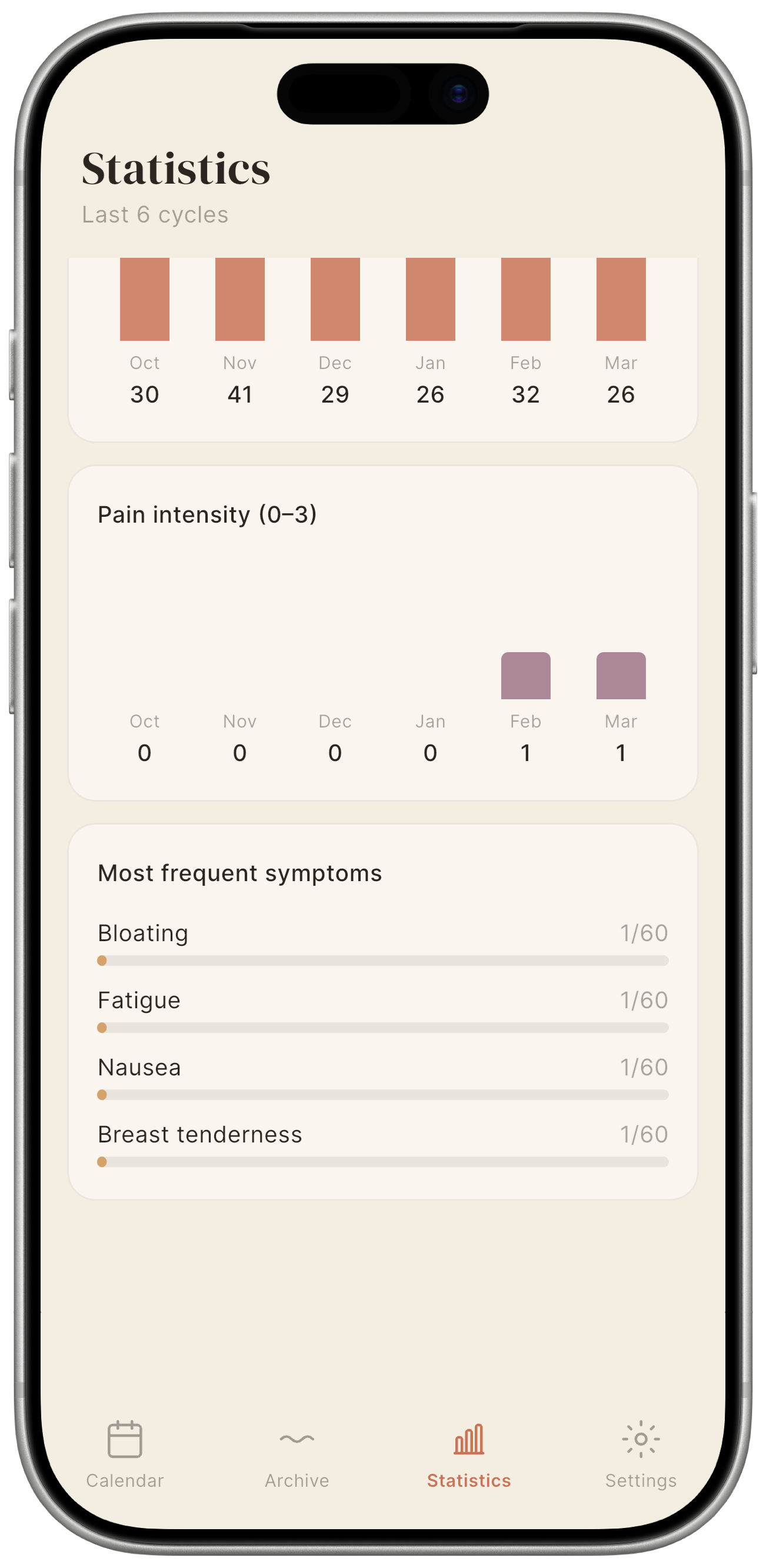
A horizontal bar chart showing how often each symptom has appeared across your recorded cycles. The most frequent symptoms appear at the top. Over time, a pattern you had not noticed can become clear.
No data? Statistics require at least one complete cycle to be logged. A cycle is considered complete once the start of the next cycle is recorded.